The impact of colour aesthetic in wildlife images
Colour correction is an art. You can get great coloration in camera with picture profiles and white balance settings. However for me Lightroom plays a very critical role in developing the final feel of an image through the colour aesthetic. When cinematographers finish filming an epic movie they colour grade it to deliver feeling, mood and emotion; it is just as important as the story itself. With photography the way we colour grade our images is just as important and it shouldn't be overlooked. In fact in this blog I am going to challenge you to step back and spend time looking at other photographers photos!
Over the past 12 months I have become more and more competent in Lightroom and it is my go-to post processing tool. I absolutely love it, it is powerful and intuitive. But with that power comes temptation. Temptation to push the boundaries to accentuate images in an attempt to make them stand out from the crowd. I've been guilty of this...working with too much saturation and pushing that clarity slider more and more. But here's the thing.....less is more.
Recently I was looking at some images that I am rightfully proud of. But as I was looking at them, something was missing and I couldn't quiet put my finger on it. The story was there. The technique and skill was there. But then I realised...
Was I conveying the mood?
- Was I doing justice to that secluded lion?
- Was that grazing giraffe really basking in that wonderful late afternoon light?
- Had I captured and married the colours of that wild dog with the terracotta Madikwe landscape as if they were one: wild dog and its territory?
The first thing I did is go and look at the galleries of two photographers who's work I admire. Now the point here is not to think about trying to replicate their style. That's not the purpose. The point is to look at others work and ask yourself "how do I feel?". Now I am not going to mention the two photographers who I referenced simply out of respect for them and the community of photographers I am engaged with. It isn't fair to single people out! But I truly love their work and their images are really an inspiration to me. Both of them have a very similar colour aesthetic and I have had some exchange online with one of them who shared with me that it took them a very very long time to work out how to get that look. And after establishing that look in Lightroom, they then modified their shooting technique to enhance it further. This for me is a natural evolution as a photographer, developing your own style is cyclic. The awareness of this cycle and the process of doing it, is the important thing.
I went back into Lightroom and decided to spend more time on getting some aspects of my images more balanced. This was a learning exercise for me and I wanted to push my processing skills further and challenge myself to think more about the images I am creating. Could I create the mood and convey that to the viewer? There is no right or wrong workflow with Lightroom. Different people start with different things first. Everyone has their own way. Here I am going to take 3 examples and show how I worked to achieve a colour aesthetic I feel creates mood in the image;
- the Giraffe,
- the Lion
- and the Wild Dog
and I am going to explain simply what I did and why (what mood was I trying to convey?).
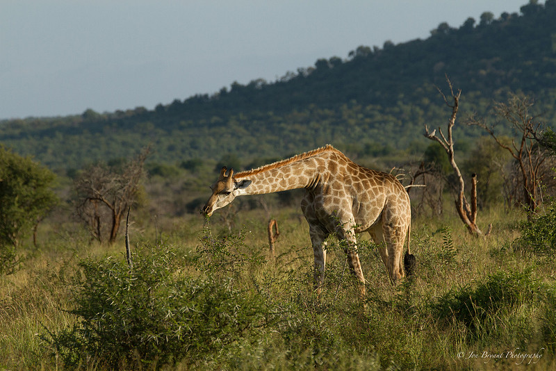

Let's start with the Giraffe. Here's a nice solid wildlife shot. A giraffe grazing on acacia, and what's nice about this shot is you see how the Giraffe is having to bend down to get some food. What else makes this shot? Well I included some landscape elements as a back drop and that sets some nice context. But when I looked at this shot I knew it needed some tweaking. What doesn't come across to me in this shot is the warmth. This shot was taken on an afternoon drive with the a warm sunlight low in the sky. The original image didn't convey that mood of the afternoon warmth. The colours are a little flat for my liking and giraffe's colour isn't quiet right. I can see the light hitting the Giraffe's body but I am missing that warmth.
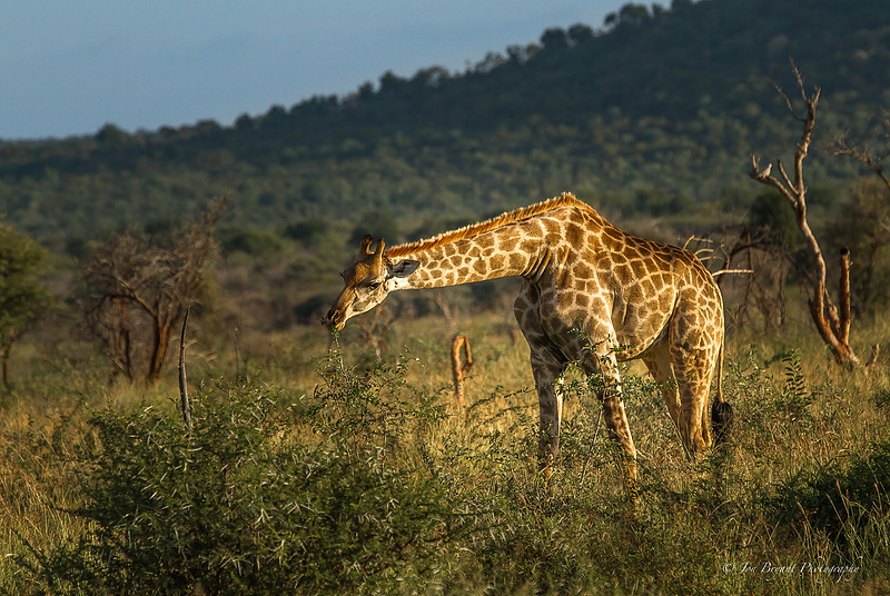
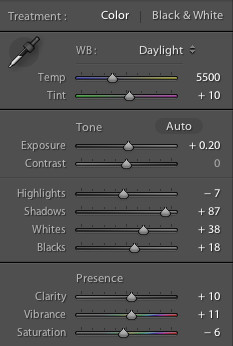
So here's the image I tweaked. First I made a slight crop. I wanted to tighten in on the Giraffe to get the viewer closer to the scene and the fact the Giraffe is grazing. We now see that more clearly. Next I added a horizontal grad filter on the top left corner just to change the sky from an overcast grey to a slight blue tint. That gives a nice contrast and hints at a clearer sky, consistent with that warm sun I am trying to convey. I did my main corrections for colour (see below). The key here was to bring shadow detail up and work more with the vibrance slider than the saturation. This changes the intensity of colours that are more muted without boosting the strong colours. This is very different to overall saturation which universally boosts all colours. Using saturation alone, you run the risk of over saturating an image. With this giraffe this is important as I don't want to over saturate orange and yellows.
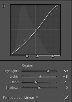
Next I customised the contrast, which is important in terms of bringing balance to contrast in the shadows, mid tones and the highlights. Look how I boosted the contrast in the highlights - yet I've not changed the shadows. This is very important in accentuating that warmth for the colour modifications I have adapted.
Finally, I applied a radial filter. This is a super new tool in Lightroom 5 and I really like it. When I work with video my editing software allows me to apply a similar effect to highlight interview subjects by changing the contrast within and outside of a highlighted area. By using the radial filter I am able to project the giraffe and modify parameters outside the radial filter, so outside of the giraffe.
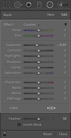
And here, all I did was drop the exposure by about a half a stop. What did this do? This really put the Giraffe in the spotlight. It was this final action that shows the warmth of the sun on the Giraffe's body and for me we now have an image that conveys the mood much better. I made some final tweaks in individual colour tones with hue, saturation and luminance to get the final colour aesthetic just right.
Having developed those settings I now saved them as a preset and applied them to two other images where I wanted to convey the mood better. Once applied, I made some localised tweaks for each image where necessary.
Let's take a look at the Lion image I mentioned...
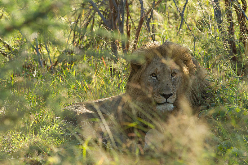
So we arrive at this sighting, a young male lion, and he's very secluded. We had restricted access and a restricted view. So my first thought was "how am I going to get a clean shot of this lion?". I realise that is the wrong question. I looked again. I then asked myself "what am I seeing?". I am seeing a Lion that doesn't want to be seen. I have foreground clutter to a clean image. In actual fact this clutter is the natural framing of the image. So I used a shallow depth of field and focused beyond the foreground foliage and onto the lion. Like this I am giving a sense of perspective: the Lion is hiding and secluded. The image is not balanced compositionally, but that is due to my physical location at the sighting. The other issue is that I have very mixed light in the scene which is creating different shadows and highlights both on the Lion and the surrounding bush.
With my saved preset this is how I processed the image...
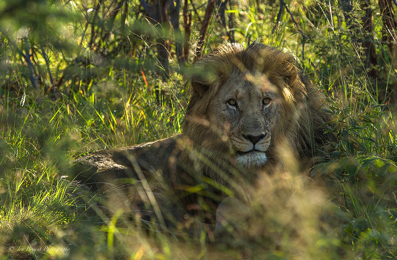
I have cropped the image to draw the viewer in to the central element: the stare of the lion. Because of the mixed light, I wanted to accentuate the shadows much more. Why? Because I want to change the mood to one of seclusion. By accentuating the shadows (making them darker) and reducing the exposure with the radial filter in place (focused on the Lion's head), I am exaggerating the mood of the environment the Lion is in. I then used a special adjustment brush to treat the Lions face to bring more contrast and detail, as I want this to stand out from the frame: his look towards the lens, has to be the element of the image that you first connect with.
Finally let's take a look at the wild dog image. This one is much more about aesthetic rather than mood but I think it highlights my point well.
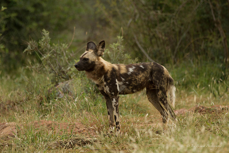
This wild dog was photographed just after a feeding frenzy on an impala. There was a lot of excitement and each of the dogs had gone from feeding mode to alert mode. They were all very skittish and aware. During feeding their defences were down and now they were on the alert again. His ears are pricked backwards. But the colours to me don't do the image justice. The temptation here would be to punch some saturation in, but I want to resist that temptation. The mood I want to bring into the image here is purely based on the wild dog's colours in the Madikwe landscape of green foliage and terracotta earth. I want to have a colour aesthetic here that shows wild dog and terrain as one, I want to convey this is his territory. Starting with the preset I developed for the Giraffe image here's the processed image...
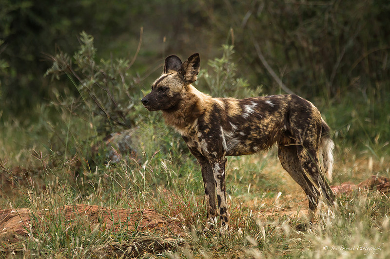
With the preset and application of radial filter, I've now got something which conveys the mood I am looking for. The colours are very well balanced and not reliant on saturation, but more delicate tones where the landscapes and wild dog's coat really compliment each other. I have the mood I am looking for; A wild dog in his territory. I appreciate that this last example is much more subjective to ones eye, but back to my point; the processed image for me conveys much more feeling than the original. And that in essence is why colour aesthetic of an image is so important.
So I come back to the beginning of my blog...I challenge you to go and look at wildlife images. There are plenty out there which are truly superb and tell a story. But when you look at those images ask yourself "how do I feel?"...now look at your own images and ask the same question...
Then remember this question next time you pick up your camera.
Have a good one...
Jon